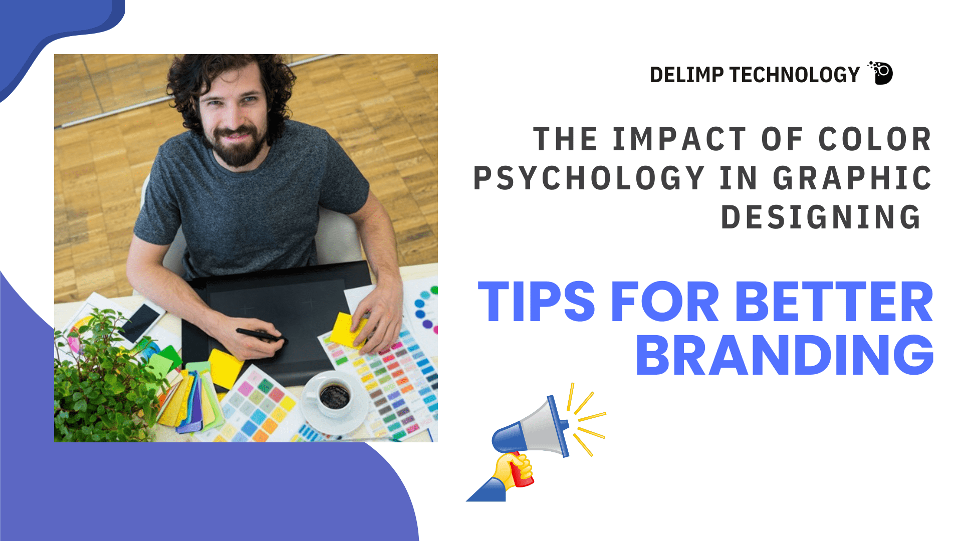
For the designer, color is not purely decorative; it is a communication medium and an instrument of identity and behavioral management. Essential knowledge of color psychology in graphic design helps to identify the potential strategies for creating branding messages appealing to customers. In this blog, I explain why color matters in graphic design and provide practical strategies for its use.
The Science Behind Color Psychology
Color psychology is the interaction between two main variables – color and perceptions and reactions of people. 90% of a product’s appeal is determined by color and this makes color an important ingredient in branding strategies and marketing. For instance:
- Red creates a sense of urgency, and passion and is therefore perfect for use in messages that need some form of action to be taken.
- Blue is associated with trust or professionalism; companies include it in branding applications.
- Yellow appeals to optimism and creativity among young people, since its colors are related to the sun’s beams.
When brands use these ideas of color psychology in graphic design, they get to design impressive works.
Why the Analysis of Color Uniformly Concerns Branding
Brand Recognition: The utilization of brand colors improves brand recognition by 80%.
Emotional Connection: Color creates emotions, that is, the feelings customers have towards a brand.
Cultural Relevance: To have colors, different meanings are embodied in cultures across the world. That is why white is an image of purity in such nations as the USA, while it symbolizes mourning in some nations of the East.
The prudent implementation of these principles guarantees that the designs fit the companies’ images and client anticipation levels.
Suggestions for the Appropriate Application of the Theory of the Color
Understand Your Audience: Some of these issues include: It is essential to investigate the marketing segmentation of your target market so that you choose colors that suit them and their culture.
Prioritize Contrast: This will help in reducing the variation and changing the background color from time to time so as to stand out from the rest of the text, especially logos or any ‘Call to Action’.
Leverage Color Harmony: Use techniques such as; using complementary color or analogous colors to design elements with better-looking outcomes.
The Role of Tools in Graphic Designing
Adobe Illustrator and Canva, for example, have special tools used for playing around with the colors of the intended palette. Also, analytics show how the audience experiences specific colors in your campaigns so it becomes necessary to integrate colors that create a great impression.
Case Studies in Branding Using Color Psychology
Coca-Cola and Spotify are examples of how color can be used to help create incredibly memorable brands. The color red in Coca-Cola represents energy and excitement; green in Spotify represents growth and harmony to its tech-inclined audience.
Conclusion
Applying color psychology in graphic design is not just a fad: it is simply necessary to succeed in modern branding battlefields. Through the emotional and psychological effects of colors, businesses can produce attractive designs that create loyalty.
Hear the rhythm of color and rejoice, your branding efforts weave into harmony with the audience.
Frequently Asked Questions (FAQs)
Q1: What is color psychology in graphic design?
Ans: Color psychology in graphic design refers to the study and application of how colors influence human emotions, perceptions, and behaviors. It involves using colors strategically in designs to evoke specific reactions and create a brand identity.
Q2: How does color affect branding?
Ans: Colors play a crucial role in branding by enhancing recognition, establishing emotional connections, and shaping how customers perceive a brand. For example, red conveys energy and urgency, while blue symbolizes trust and reliability.
Q3: Are cultural differences important in color psychology?
Ans: Yes, colors hold different meanings across cultures. For instance, white symbolizes purity in Western cultures but mourning in some Eastern cultures. Understanding these differences ensures that your designs are culturally sensitive and effective globally.
Q4: How does color contrast improve graphic designs?
Ans: Contrast enhances visual clarity by making text and elements stand out. For instance, pairing light text with a dark background or vice versa ensures readability and draws attention to key features.
Q5: Can color psychology improve conversion rates?
Ans: Absolutely. Research shows that color can influence purchasing decisions. For example, using colors like red for call-to-action buttons can create urgency, encouraging users to click or purchase.


